Development Process: The Great Oaks
This page covers my approach to:
- Designing and iterating on game systems and overall game design
- Making a Game Design for a 2.5d Local Couch 2 player narrative platformer gmae
- Level design, from paper, white boards, prototypes and concepting
- Iterating on Level Design
- Narrative design through Level Design
- Four Step Level Design
- Puzzle Design
About Project

A 2.5D platformer Co-op Game with a humorous tone based on the concept of caring. In this vertical slice, you may get to know better our main protagonists, Rani the Frog and Onwell the Robot. To play this prototype you need to be two players, we advise using "Parsec" to play remotely with a friend.
This project was made as for a University course, the course being "Game World Design" at the IT University of Copenhagen that took exactly 3 months. We have taken this project from a barebones initial concept to a playable prototype with engaging, fully voiced characters, colorful environments, two-player platforming and dialogue interactions, and a world of new wars and ancient secrets.
My Roles
Game Designer
Pitched the initial idea and got the team together to work around a 2.5D Co-op 2 player narrative game. The theme of the world would be related to studio ghibli, with its many creatures and spirituality. I made a Game Design Document for this project, I observed playtests, brainstormed ideas and features. Additionally I helped designing and pitching the narrative design along with Tobias and the core plots and things that would happen. I did however not write any of the dialogue itself.
Level Designer
My main practical role in the project was Level Design. I worked on concepts, greyboxing, mechanics. Used four-step level design technique to teach players mechanics in a balanced flow way. I made and stylised the whole terrain and environment I made a lot of prototypes for levels, tested different versions. I observed players and fixed problems with the levels and such
Programmer
I did a lot of small stuff, such as the menus, UI programming. I did the puzzle design programming. I helped fixing bugs every time I saw one. I helped with the character controller and made the initial prototype one. I made the water shader.
Development Process
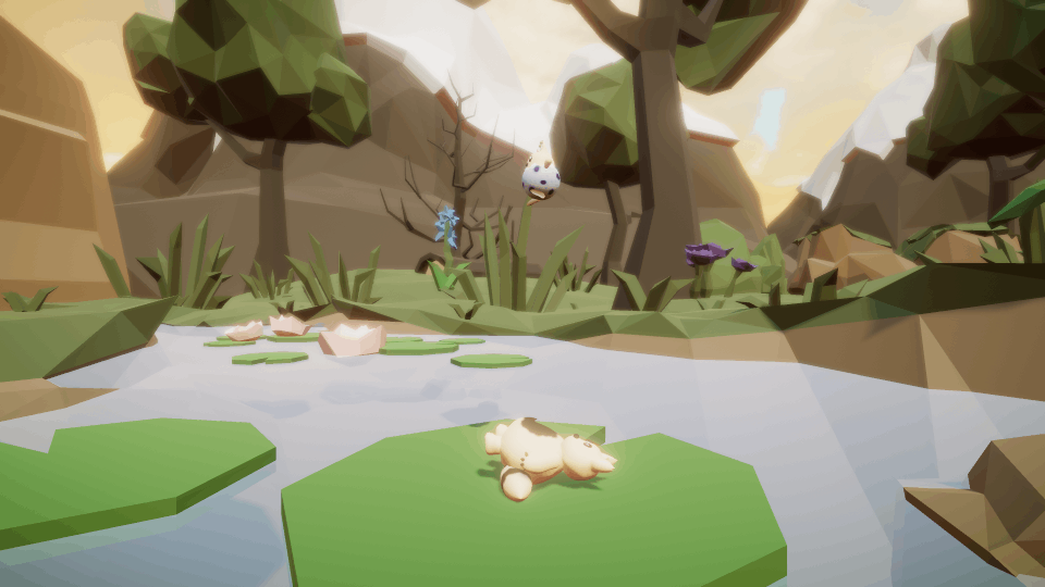
The core idea of The Great Oaks originated from my game pitch which featured a 2.5D cooperative platformer and was heavily inspired by Unravel Two (2018) and Hoa (2021). From there, we settled on the genre of the game and decided to use cooperation as a theme and one of the design pillars for our final demo.
We found the art style of Studio Ghibli films very captivating and challenged ourselves to make a 2.5D game with such a style. Still, in terms of our theme and art style, the specific narrative, characters and mechanics kept changing at each stage. What remained constant was our primary design pillar - creating a game which dealt with the concept of caring.
Our design department was run by me and Tobias, although given that everyone contributed during the ideation stage and our ideas built on each other, the whole group should get credit for the general game design. I designed and polished the level in our game whereas Tobias wrote the dialogue, created cutscenes and composed all of our audio elements. The two of us worked closely together to enable the synergy between the gameplay and the story.
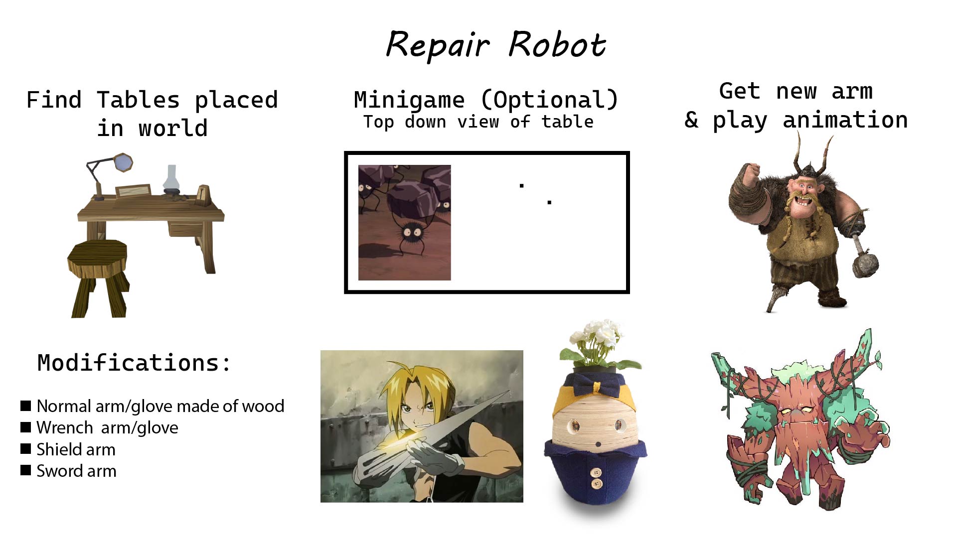
During the early days of development we were trying to come up with a mechanic that worked well narratively and cooperatively. Something that also spread the caring message we were trying to portray. One of the initial things we did was make early concepts of mechanics and features. At this point we knew one of the characters was going to be a robot and the other one a smaller one. This mechanic basically was setup to upgrade the robot, and the second character to help upgrading and repairing the robot to incentivise cooperation. This was one of the many early concepts we killed during development.
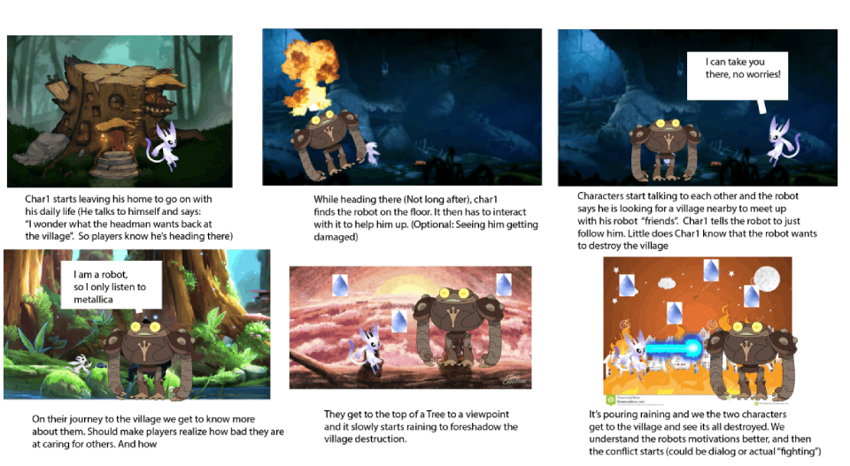
One of the the initial story board suggestions was this one I made. A lot of it actually was kept in the game. For example the end where the conflict was meant to actually start doesn’t happen, nor does it rain. This was a vertical slice, and we did design more narrative that we actually made for the story. Basically our demo consists of part one of what the whole game would be.
As we gradually scoped out the idea of having these neighbor characters, we realized that the main characters would have to represent the game world and the central conflict on their own. This led us to choose a narratively efficient approach - letting the two main characters exemplify opposite sides of the conflict: One would be part of an attacking robot force, crash-landing due to his own ineptitude, the other would be an outsider among the animals, who avoided the attack due to his reclusiveness. In doing this, we could present lore from both the animal and robot societies without having to create additional characters.
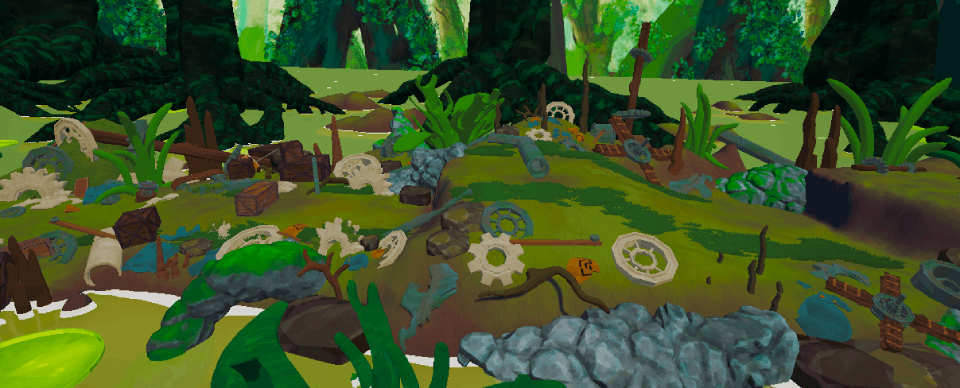
We thought it would produce an interesting dynamic to have the mechanical nation be an ancient society, much older than the youthful animal nation. We decided that the forest had in the distant past been a settlement of the mechanical nation, and that the remnants of this ancient settlement would be scattered around the forest, though the animals would have no clue what they were.
Level Design
When prototyping the initial level designs, we first made sketches to get an overview of the pacing of the levels. We tried using the 4 Step Level Design philosophy ("Kishōtenketsu") as much as we could, which consists of “teaching, developing, twisting and then throwing away” . We didn’t get to the third step of this philosophy, twisting, for a few of the mechanics since it required more code and more polish. Considering our priority was the Game World this was not feasible. We also wanted to introduce mechanics gradually, so we divided the level into different zones. Most zones were designed using the 4 Step Level Design philosophy for each mechanic.
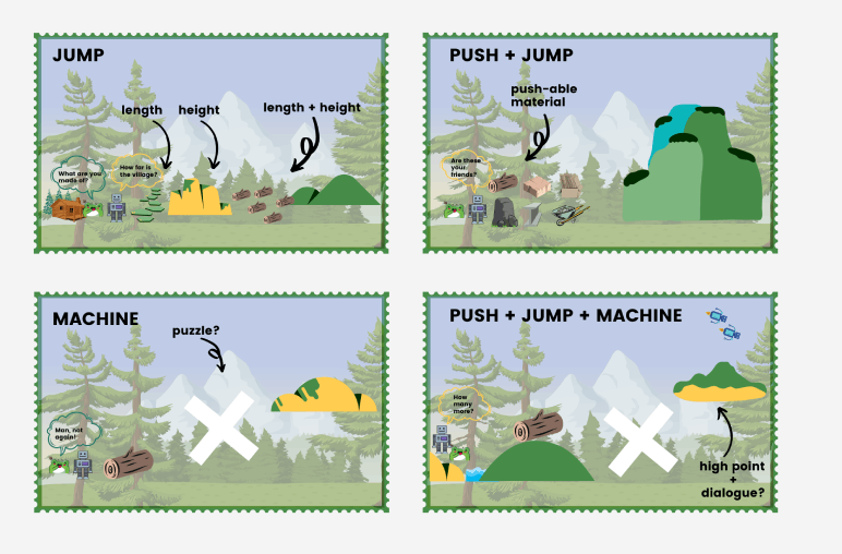
We start by introducing each mechanic in a safe environment where if you fail there’s no negative feedback. For example, the introduction of the jump mechanic starts quite basic with a small height, moving on to a taller height, then to multiple platforms and lastly challenging the players to jump on lily pads and trunks, where if they fail they respawn in the last checkpoint. This picture shows an early storyboard of the level design.
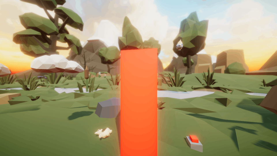
Some of us in the team had previously explored 2.5D co-op platforming in a Game Jam (Boopy and Beepo, 2022), as observed in this picture. When making the level design for that project, we realized that creating a natural environment exclusively using pre-made assets was a hassle. For The Great Oaks, we therefore decided to use the Terrain tool instead, allowing us to rapidly expand our environment. This helped avoid having the artists create an enormous amount of environment assets diverse enough to make a coherent game environment. We also realized during the game jam, that for the water we would need to create a custom water shader to get a pleasing look.
The main tools used in the development stages in Unity were Probuilder and Progrids which helped with quick greyboxing,on an easily adjustable grid system. MTree was used to procedurally generate trees. The Unity Terrain tool was used to craft and paint all the terrain.
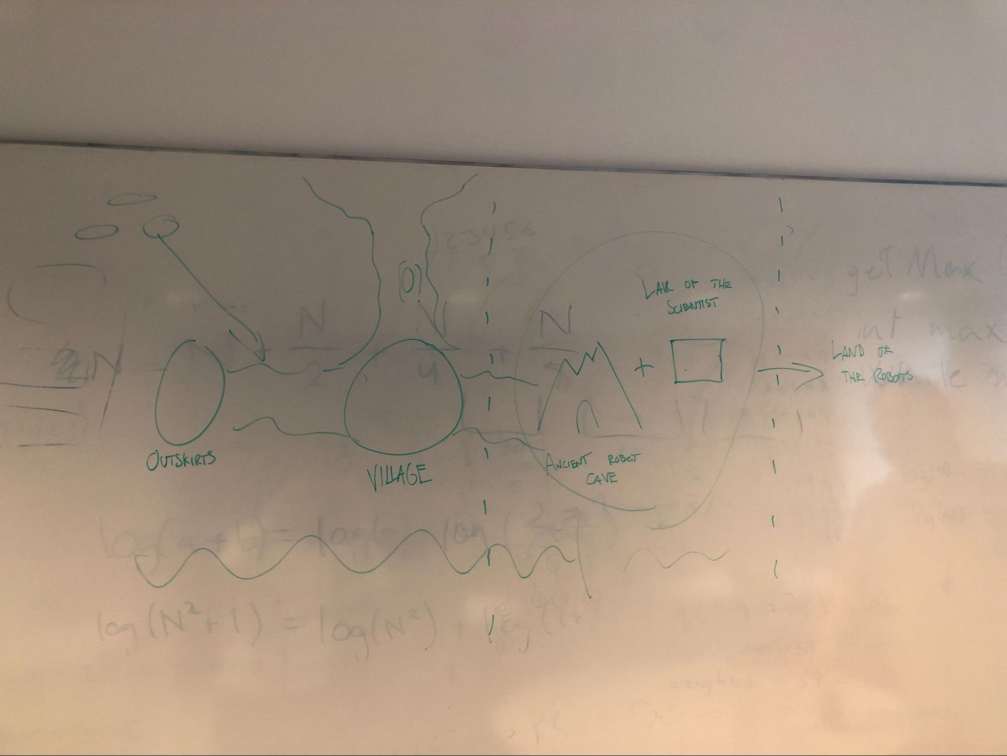
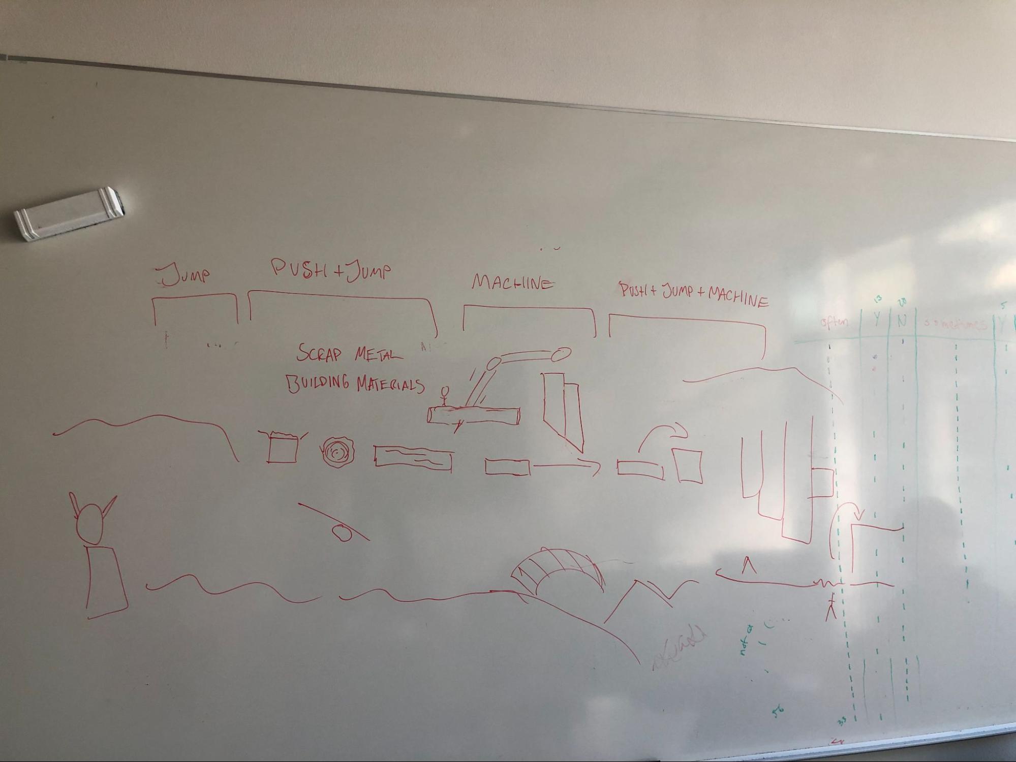
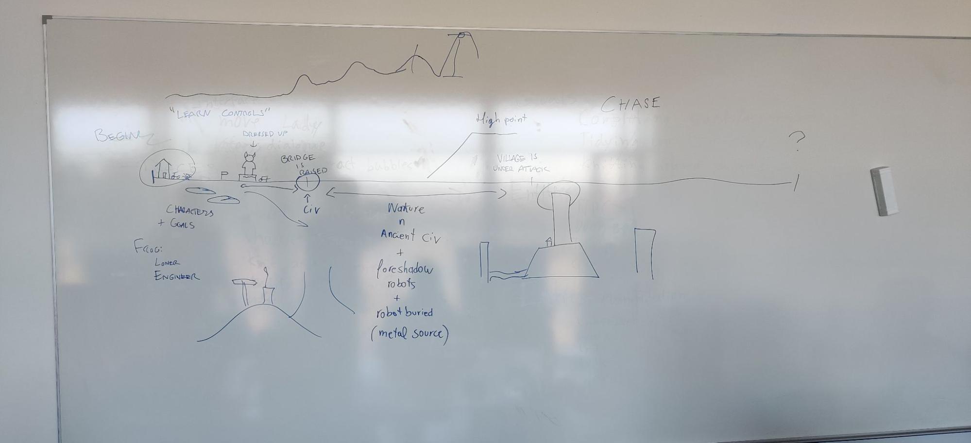
We started by making a lot of concepts of what the Game World would be and building it. Our game focused a lot on an ancient civilisation and a village of humanoid critters based on Studio Ghibli movies. In this pictures there were a lot of early concepts about the story of the world, the main plot points and the environment of these areas. We tried to connect Level Design and storytelling the whole time, so we worked very closely to this. Such as the last point of the story being a high point where players have to climb to reach the climax of the story.
Besides the drawings in the white boards, we always prepared for these meetings, brainstorming was encouraged before meetings so we could focus on the concensus and decision making. This also allowed for people who don’t speak up as much, to be more involved. Additionally there were a lot of level design that was made solely on paper by me, that I used to work on the structure of the level itself, which is not shown here. However each section for a mechanic had one.
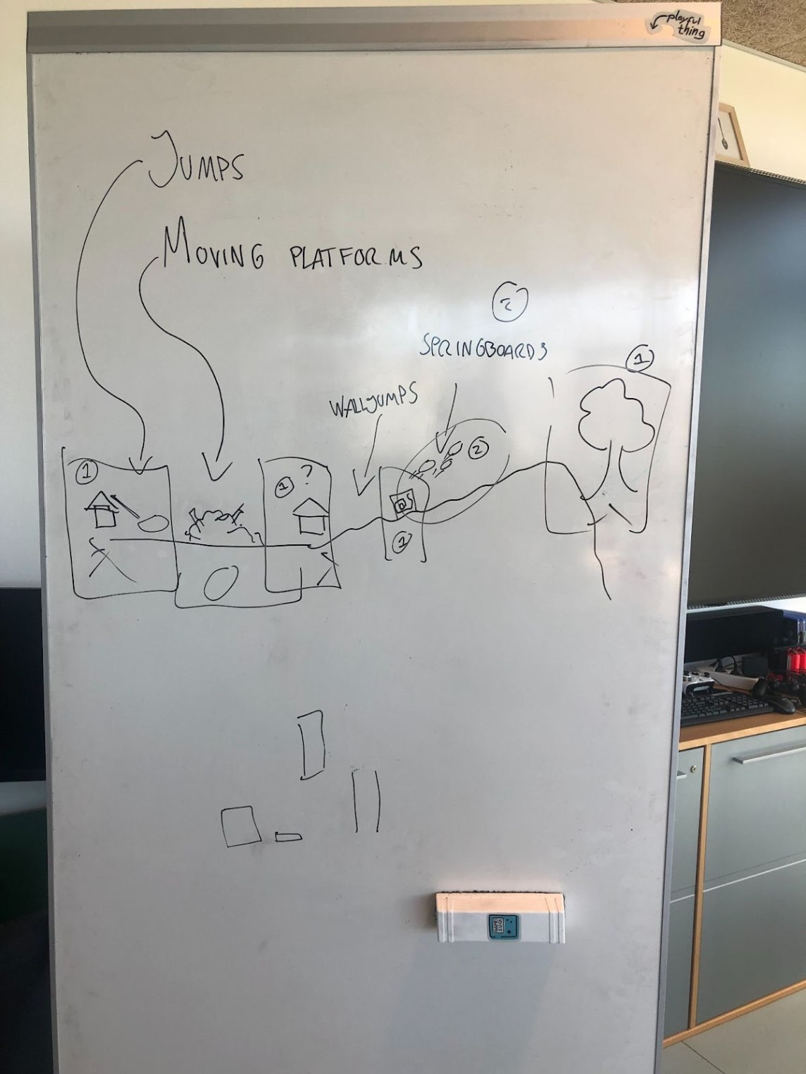
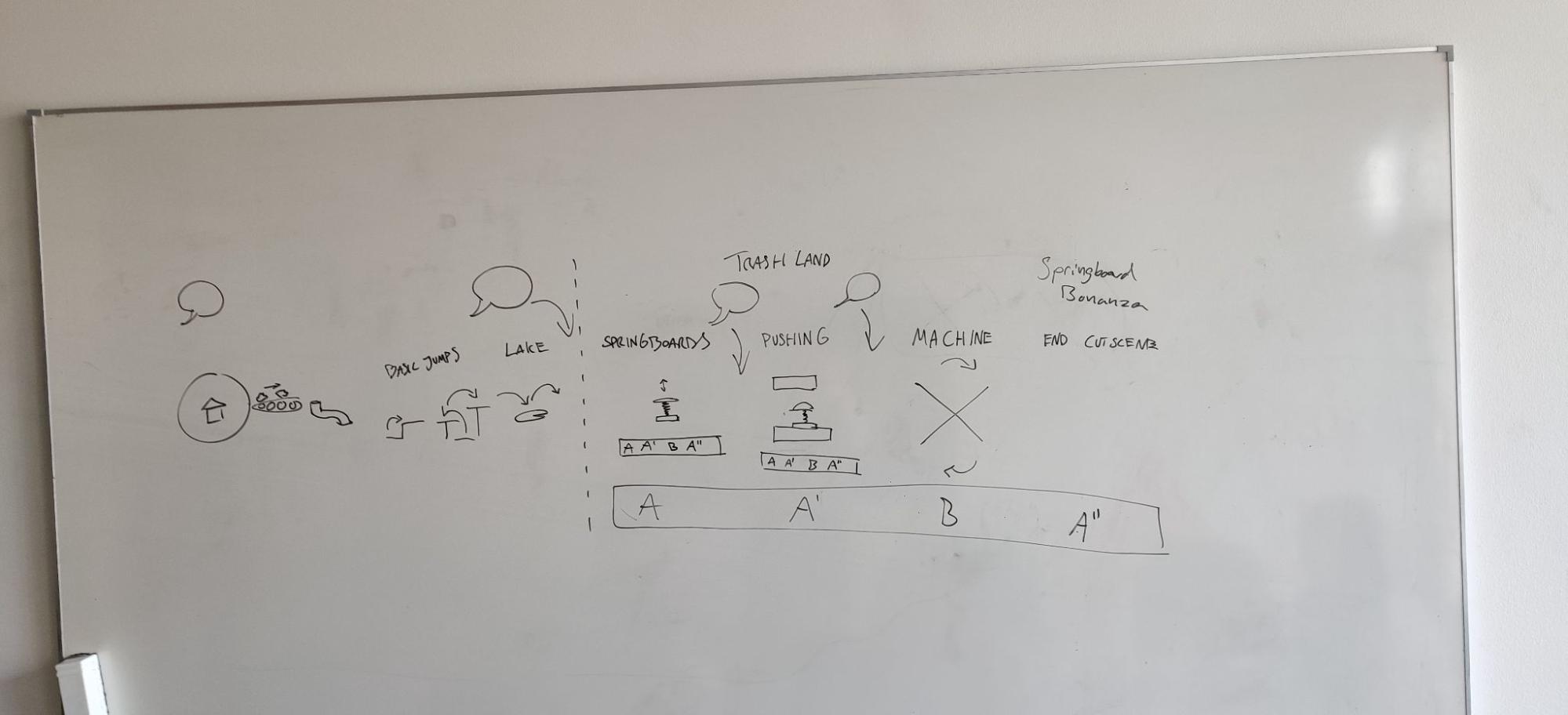
Knowing the characters and the main plot points, we started making our decisions about where key story moments would be placed in the level – moments where we would want the dialogue to be the main focus. We broke down every section of the map. The key places, the places where dialogue would happen and of course the four step level design breaking down of mechanics.
Prototyping
When prototyping levels we first had to iterate quite a lot since some mechanics were cut and some replaced. However, the overall structure of the process remained more or less same for each zone. Firstly, different puzzles were designed on paper with many variations, and then we chose 4 of them in order for the 4 Step Level Design. Multiple paper design iterations were made. Once the paper design was done, a greybox was created for each zone, which had to be adjusted according to jump heights and movement speed while keeping the pacing of the dialogue in mind creating wider areas for those.
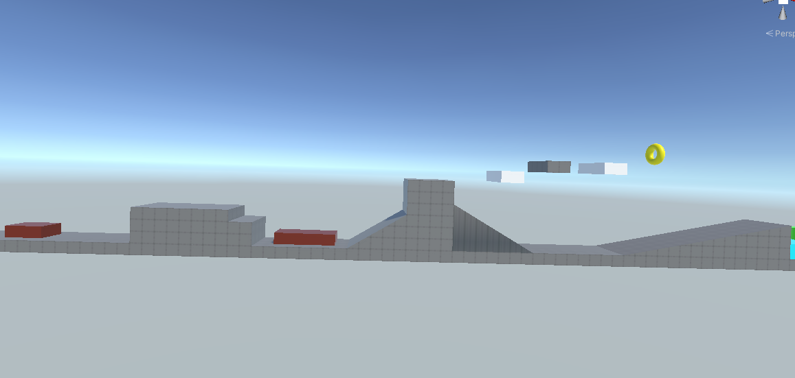
In the initial conceptualisation of the levels, we wanted to have optional areas for players to increase their skills, learn by themselves and get positive feedback. As seen in this picture, this is designed to reward players for exploration by improving their skills and capturing items such as the yellow torus in Figure 40. In the end, we decided to cut this because of the amount of extra level design we would need to produce. We instead focused completely on the main part of the world that mattered in terms of the narrative.
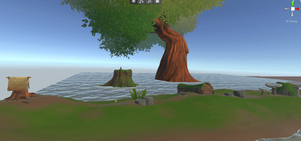
After greyboxing the level, terrain creation was the next step. When creating terrain there was a big learning curve since no one in the team had ever used the Terrain tool to a significant extent, furthermore making a swamp and adjusting it for a 2.5D platformer was a big challenge, since the terrain tool tends to be used for open world games. An early demo was prototyped to have a better visualization of the concept and test the terrain tool for a platformer as seen in this picture. This was all scrapped, including the assets, since it was just a visualization to see what it could possibly look like, similar to a 2D concept, but I made it using assets instead, this helped figuring out a concept and how hard making a swamp would be.
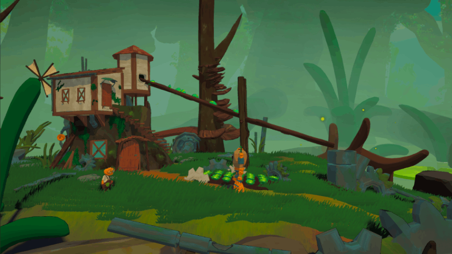
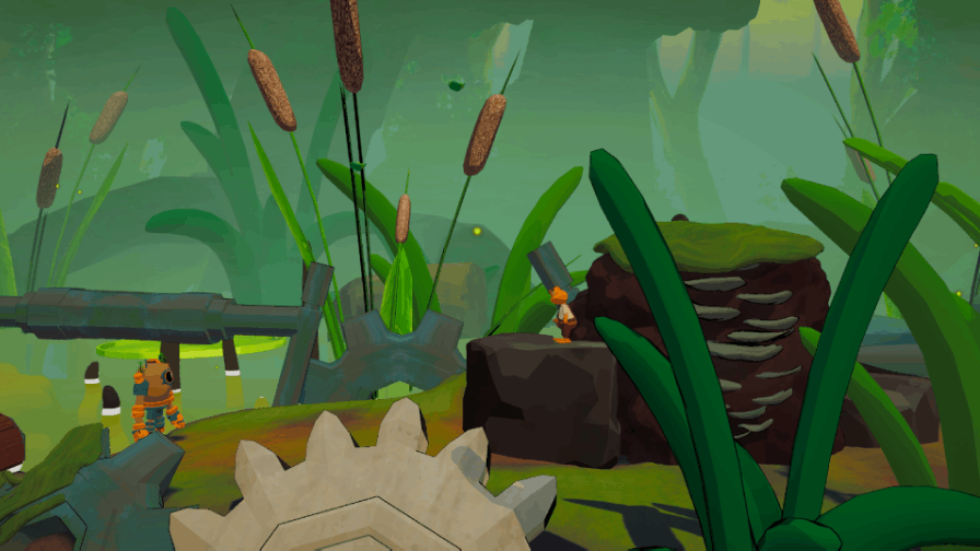
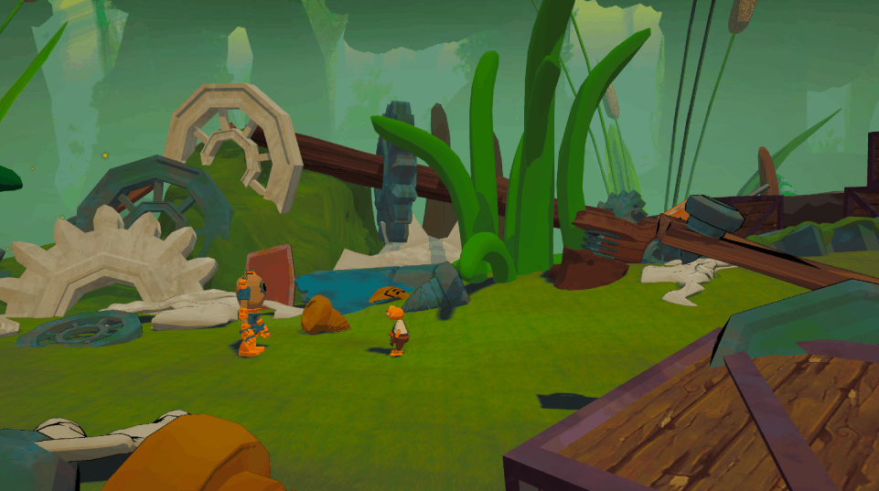
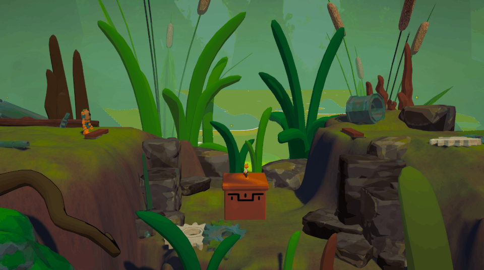
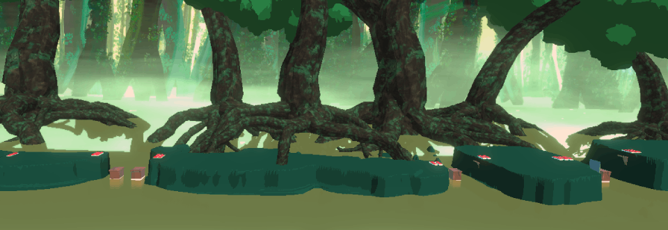
The terrain was iterated often, in many different forms. An initial concept can be seen in the first picture with the blue water below, where we tried to make a shader for the terrain to mimic the cel shader in our materials. I also used MTree to generate trees here and customize them so they looked like swamp/bald cypress trees. Below you can see the early concept to the final version. You can spot the cabbages on each picture.
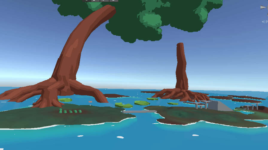
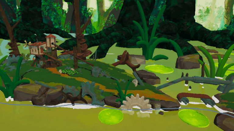
For the water, we wanted something simple and stylised that would have foam detection around the edges, visible water depth mimicking a cartoon style and without any displacement for simplicity. So I made water shader was made using Shader Graph as seen the picture.
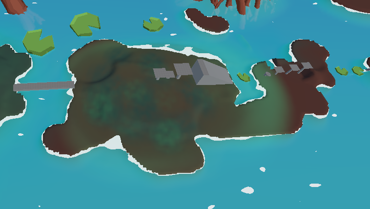
Some of the zones that got greyboxed were tested and adjusted, however, in the end, some of them had to be cut due to polish and time limitations. There was a zone where the main mechanic would be springboards, which can be seen in second picture below. However, it got cut due to not having enough time to polish it. Similar to a zone completely focused on different puzzles using physics, as shown in the first picture below. As we ended up moving away from Unity’s built-in physics system in the middle of development, these sections had to be cut.
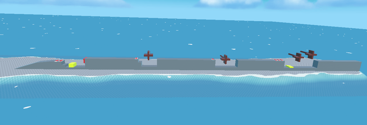

The first level I made was for early prototyping and figuring out how big the map should be, how many islands the world should have, how long players should spend on each island, and how they interact with the game's mechanics and systems. The second level used a grid system, and a boss fight test area was added (Blue cylinder walls area). Additionally, we tested time pressure by adding a mechanic similar to battle royales, where the area the players can travel gets progressively smaller and smaller due to a wall of death following the players. This also made sure players could only backtrack a little.
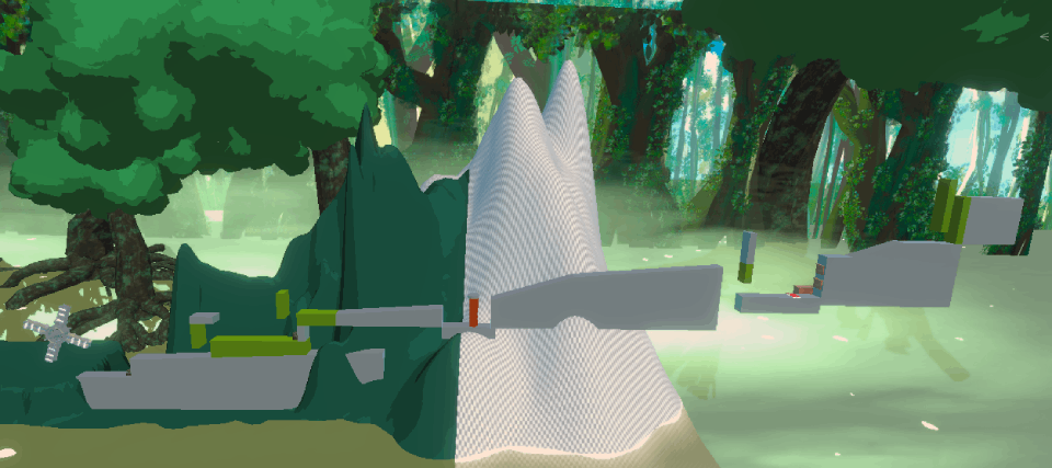
After the greyboxes were done and well tested. I would carve the terrain around the greyboxes. I would also leave the colliders of the objects, even though the objects were hidden. This was made to make sure I wouldn’t have to fix it later. The only thing was that I had to make sure that players didn’t look like they were levitating, but was easy to fix this by adjusting terrain and having some foreground-.
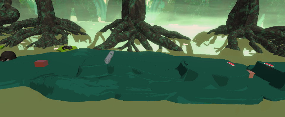
I had designed a whole 4 Step Level Design area for the pushable objects. However, we decided we had to cut some more things to completely focus on the more important aspects of creating a coherent Game World and focus less on the mechanics. So the pushable zone was mixed with the puzzle area. In a sequence you can see the workflow of the development process from greyboxing to replacing the terrain, then polishing and painting in the pictures below.

Puzzle Design
During the project I designed Puzzles for the game. These were very simple and used the same formula. I was juggling a lot of stuff at this point, so tried to design something fast and simple. To be honest there is a lot I would have made different, due to still thinking they were too simple and got repetitive quickly (Honestly not even that fun). However Wabi-Sabi right? ...
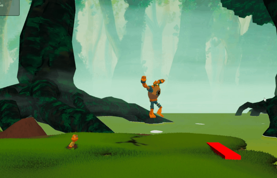
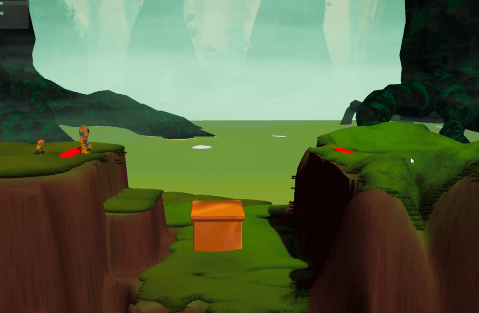
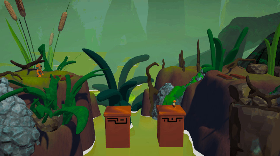
The puzzles were designed with cooperation and caring behind. The initial puzzles are easy and offer little punishment. As they progress players can actually fall into water and are forced to respawn and start over. So there is a difficulty progression in the puzzle design, however I did not introduce very interesting twists that would have made it more interesting and perhaps fun.

Screenshots
